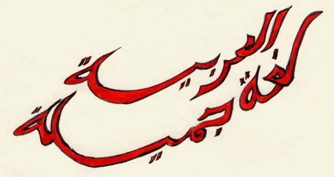
al-'arabiyyah loghaton jamillah
The Arabic Calligraphies of Nesyap Knarf
Click here to visit the Galleries
The above calligraphy says: The Arabic language is beautiful. Beside other aspects of the Arabic language, this holds particularly true for the Arabic script - Arabic calligraphy is beautiful. There are several reasons why this is so.
Historically, Arabic has been the language of Islam, the language in which the Qur'an was written, the language of God. Therefore Arabic was venerated beyond what one would expect for a quotidian language. I link the beauty of Arabic calligraphy to Islam in a purely secular fashion. While many will attribute the beauty of Arabic to Islam, I attribute it to their attribution of it to Islam. For centuries, therefore, the development of Arabic calligraphy has been a religious duty: under a ban (at least partial) of representational art, particularly of humans, but also extended to animals, Arabic lettering has been used for ornamental purposes, in mosques as in everyday life. At the same time, Qur'ans had been copied exclusively by hand, well beyond the invention of the printing press (indeed, it was forbidden to print a Qur'an mechanically). Another of the big artistic contributions of the Islamic empire was in the realm of architecture. While calligraphy adorned mosques and other buildings, a collection of calligraphy is hardly complete without a Shahadah in the shape of a mosque with several minarets made of Alifs and Laams. (This collection is hardly complete).
Arabic was also the language of a large empire, and in imperialist fashion, the language spread. Not only was the Arabic language adopted by the conquered, but it was also adopted, along with the religion, by the conquorers - Mongols, Turks - whole, or in part.
The beauty of Arabic calligraphy relies therefore in part on the efforts of many people over wide areas and long centuries with a deep dedication to making Arabic calligraphy beautiful.
But there are also intrinsic properties contributing to written Arabic's beauty. Arabic is a cursive alphabet (actually alif-baa ) of 28 to 30 letters (depending on whom you ask), most of which have up to four forms, depending on whether they occur at the beginning (initial), middle (medial), or end of a unit (final), or whether they stand alone. It is however not as difficult as it sounds, as the four forms of each letter are similar.
And here is where the intrinsic beauty lies. The forms of the arabic letters are simple. For example, the letters for the sounds 'b','t','th','n','y' all look alike in the initial or medial position, except by the number of dots above or below them, and they are of the shape of a short vertical stab up from the base-line. Can you get any simpler than that? Yes, you can: reduce these letters to the dots themselves, floating somewhere above or below the base-line. (The Kufi style does trhe opposite. It keeps the stab, and throws away the dots, making these letters indistinguishable). In any case, it is the simplicity of these elements that make the written language so aesthetically versatile and fascinating.
There are six major calligraphic styles of Arabic: Deewani, Kufi, Naskh, Riqa, Ta'liq (Farsi) and Thuluth . While these are the traditional styles, Arabic calligraphic developement is not dead. Many are still actively developing the art further. Me? I'm still an infant at this, learning to walk. Mostly, I let the words and the letter shapes guide me, without paying much attention to tradition; I try, for example to make the word for garlic look like garlic, the word for oil look that way, too, etc.; or I slip into the tradition of zoomorphism, if the word or the name lends itself to that. I do take a lot of liberties, for example, in transliterating Western names (I let myself be talked out of spelling my name with a Qaaf instead of a Kaaf, though I find the former more pleasing); and I might offer several variations, for example, two for the name "Anita": one with Ayn and Taa marbuta, the other with simply two Alifs. For practical purposes, Anita should probably stick to the latter.
As I said above, I'm a beginner. The world (and the Web) is full of the works of masters, and it is definitely enjoyable and to me a bit daunting to look at their works. I do not by any means compare my works to theirs: I am all too painfully aware of my shortcomings, particularly that my hand and my eyesight are not as steady as I would wish them. I do not try to make each work perfect (though I might throw away ten before compromising on an eleventh), but I'd like to share and display, anyway: that is what this Web site is all about. And I'm hoping that a certain practice effect will set in eventually.
If anyone should want an ecopy (jpg) of any of these, please email me, I have higher resolution copies that I can send you, than the ones on this site.
Also, I'd appreciate any feedback.
|
Themes Edibles Fun With The Family Peace Miscelleneous |
Stella and Frank |
| Calligraphy and Art |
Alifbaa and Language |
|
Islamic City Islamic Art Al-bab (the door) Sakkal Design Kamel and Mokhtar El Baba Arab Art Gallery |
Omniglot Cafe Syria The Arabic Alphabet: How to Read & Write It |